A Jupyter widget to plot the bandstructure and density of states (DOS)#
Source code: aiidalab/widget-bandsplot
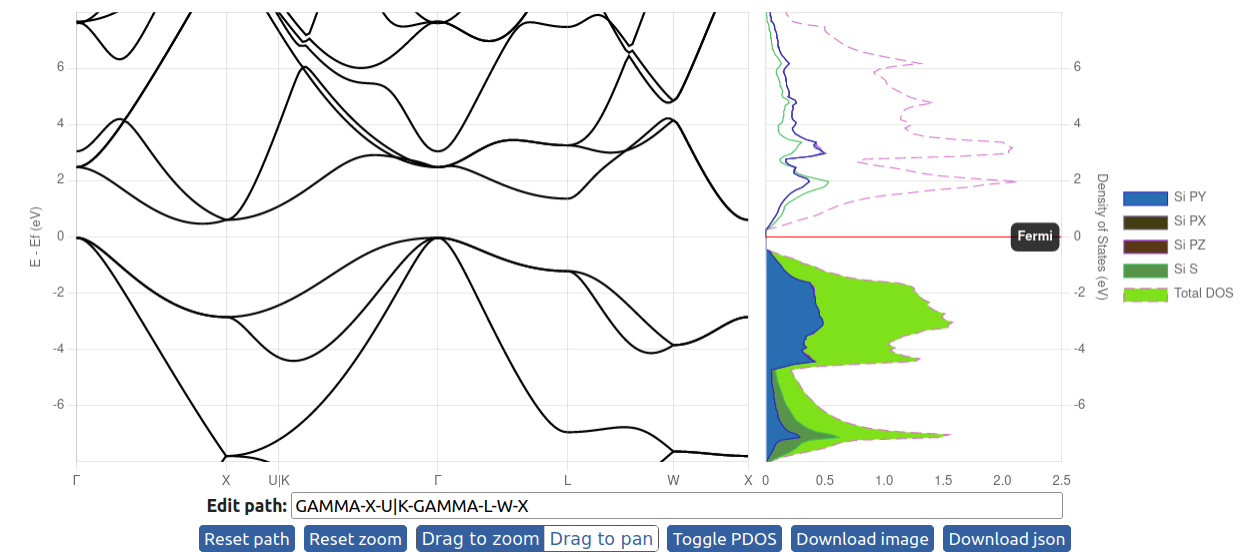
This widget facilitates the plotting of electronic bandstructure and density of states from supplied json files.
Input json files#
On the left, it plots the bandstructures. One can input several bandstructure json files as a list. The figure on the right shows the density of states, which can only show one DOS plot. The json files for the bandstructures can be generated from AiiDA with the verdi command:
verdi data bands export --format json <IDENTIFIER>
The json format for the DOS can be checked in the github repository.
https://github.com/osscar-org/widget-bandsplot/blob/main/example/data/Si_dos.jsonHere, one needs to use the json package to load the json file and pass it to the widget.
with open('Si_bandsdata.json', 'r') as file:
    data1 = json.load(file)

with open('Si_pdos_data.json', 'r') as file:
    data2 = json.load(file)
Fermi energy#
The Fermi energy is read from the bands and DOS json files. The bandstructure and density of states plots have their origins aligned according to the provided Fermi energy (the Fermi energy is defined to be zero).
In the default plot for the DOS, there is a horizontal line to highlight the Fermi level. One can turn it off by setting plot_fermilevel = False. The legend of the DOS can be turned off by setting show_legend = False.
Usage of the widget#
Remeber to pass the bandstructure data as a list of json objects. "energy_range" sets the energy range for the plots.
Plot both bandstructure and DOS#
w1 = BandsPlotWidget(bands=[data1], dos=data2, plot_fermilevel = True, energy_range = {"ymin": -13.0, "ymax": 10.0})
display(w1)
from widget_bandsplot import BandsPlotWidget
import json
from copy import deepcopy
import json

def load_file(filename):
    with open(filename, 'r') as fhandle:
        return json.load(fhandle)

si_bands = load_file("./Si_bands.json")
si_dos = load_file("./Si_dos.json")
widget = BandsPlotWidget(
    bands = [si_bands],
    dos = si_dos,
    energy_range = [-8.0, 8.0],
    format_settings = {
        "showFermi": True,
        "showLegend": True,
    }
)

display(widget)